Designing and shipping our first paid B2C experience
Designing and shipping our first paid B2C experience
From feature pitch to live B2C subscription experience in 6 weeks.
Case study
November 1, 2023
My role
I led the project as both Product Designer and interim Product Manager—defining the problem, facilitating alignment, designing the UI, and working closely with engineers to ship it in six weeks.
Figma and FigJam for design, Notion for planning and documentation, and Mixpanel for metrics.
Overview
MiSalud is a B2B company—we partner with employers to offer telehealth services as a benefit for their employees. Through this model, users (or socios, as we call them) can connect with Spanish-speaking doctors and care teams, all covered by their workplace.
But in recent months, we started noticing something unexpected: a growing number of socios were finding us on their own. Without marketing efforts on our side, people were downloading the app and creating accounts organically. Most of them came through word-of-mouth—from coworkers, friends, or family members who had already used MiSalud and trusted the experience.
This behavior pointed to something we hadn’t prioritized: a genuine need in the broader market. It also signaled an opportunity to better support individuals who weren’t coming through a company, but still needed access to care they could trust.
Goal
Make it possible for B2C socios to subscribe through the App Store or Google Play. Let them try the service before committing, and track how they move through the journey—from account creation, to trying consultations, to subscribing (or churning after the trial).
Challenge
In our beta, anyone could sign up and start a consultation for free. At the time, we had little organic traffic, so giving the service away wasn’t a concern. But as more socios started joining on their own, that model no longer made sense—we were charging companies for access, but not individuals. The challenge was to introduce a subscription model for non-employee users without pulling too many resources away from our core B2B roadmap. We needed something fast, functional, and good enough to learn from.
Process & Solution
We started with technical research to address specific requests from the business before properly shaping the solution. These are two of the most relevant ones, along with the answers from the team:
Q. Can socios have a 30-day trial without requiring a credit card upfront?
A. Not through the App Store, which forces users to enter their credit card and accept a paid subscription when enrolling into the trial. When the trial expires, we must redirect socios to a web-based service like Stripe.
Q. Can we create coupon codes through the stores? (this was a request from marketing to engage potential customers through social media and in-person events.)
A. It was possible to do this through the stores, but it was fairly complex to do it how the business needed it.
The answer to both questions was "yes, but it is not that easy." The first one, in particular, required us to take the users out of the app to pay on the web and then go back—a series of actions that were particularly difficult for our low-tech savvy profile to perform. We discussed and decided to keep the project short since B2C is not our primary business model.
The pitch
At MiSalud, we follow the Shape Up process for product development, which has proven to be both effective and lightweight. As part of this approach, I started by writing a pitch—a short document that outlines the problem (as described above), proposes a high-level solution, sets the appetite, defines the team, and flags potential rabbit holes or boundaries (the “no-gos”).
Rabbit holes and no-gos
In Shape Up, a no-go refers to functionality that’s intentionally left out of scope. A rabbit hole is a risky or overly complex area we choose to avoid to protect the timeline and stay within our appetite. For this project, here were a few we identified early on:
We wouldn't support payments through the web, only through the stores
Refunds would be handled manually
Promo codes were not part of this first version
If a user schedules a consultation and then their subscription expires, we would cancel the consultation manually in our system
Appetite and team
The appetite—the amount of time we’re willing to spend on a project—was set at six weeks by our Chief Product Officer. While we wanted to move quickly, the functionality was complex and required thorough QA. The team included two frontend engineers, one backend engineer, one QA engineer, and myself as the product designer.
Solution
I met with the Design Lead and two engineers to whiteboard the solution together. These are the scenarios we came up with:
Scenario 1
A user creates an account and is automatically enrolled into a 30-day trial:
The user will see a non-intrusive banner at the top of the home screen, letting them know they are on the trial period
A paywall will be displayed when tapping on that banner
They will be able to choose a plan and pay through the stores
They will also see a section in the profile section indicating the status of the subscription: trial or active (one month, six months, or one year)
They could start the same process to pay for a subscription from the profile as well
Scenario 2
A user has an active trial that will expire in 5 days:
The banner will change to a reddish color to give a sense of urgency, along with a label that indicates the days left in the trial
After every consultation, the user will see a drawer inviting them to choose a plan
Scenario 3
A user has a subscription already and wants to cancel:
They can go to the profile section, tap on the membership menu item, and see a list of steps to follow for canceling through the store (Android or iOS)
Scenario 4
A user's subscription is about to renew automatically:
We will send an email five days before the renewal to let them know and remind them about the benefits of their current plan
One day before, we will send an SMS with the basic information about the renewal
Project pitch in Notion
Sketches from the whiteboarding session in Figjam
Tracking behavior from day one
I defined the _events_ we will send to Mixpanel to measure the solution's effectiveness and observe our socios' behavior. These are some of the metrics I suggested to implement:
Payment flow: started: triggered when the socio opens the paywall - triggered_from: a property that tracks where the event is triggered from (home screen, profile, or post-consultation)
Payment flow: plan selected: triggered when the socio taps on one of the plans - membership_length: a property that tracks the plan they selected (one month, six months, or one year)
Payment flow: payment successful: triggered after the socio pays through the store
Payment flow: subscription canceled: when canceled from the stores
Payment flow: subscription renewed: after automatic renewal
Payment flow: subscription updated: when changed to another plan through the stores
User traits: besides the events and their properties, we attached (or updated) properties to the user profile based on the status of their subscription: - membership_status: subscription active, trial active, trial expired, membership expired - membership_length: one month, six months, or one year - user_type: B2C or B2B
These metrics would allow me to create reports, funnels, and flows in Mixpanel to understand where users typically drop, from which touchpoint they subscribe the most, and which plans they choose.
Mixpanel events documented in Notion
I presented the pitch to the stakeholders, got a thumbs up, and kicked off the project.
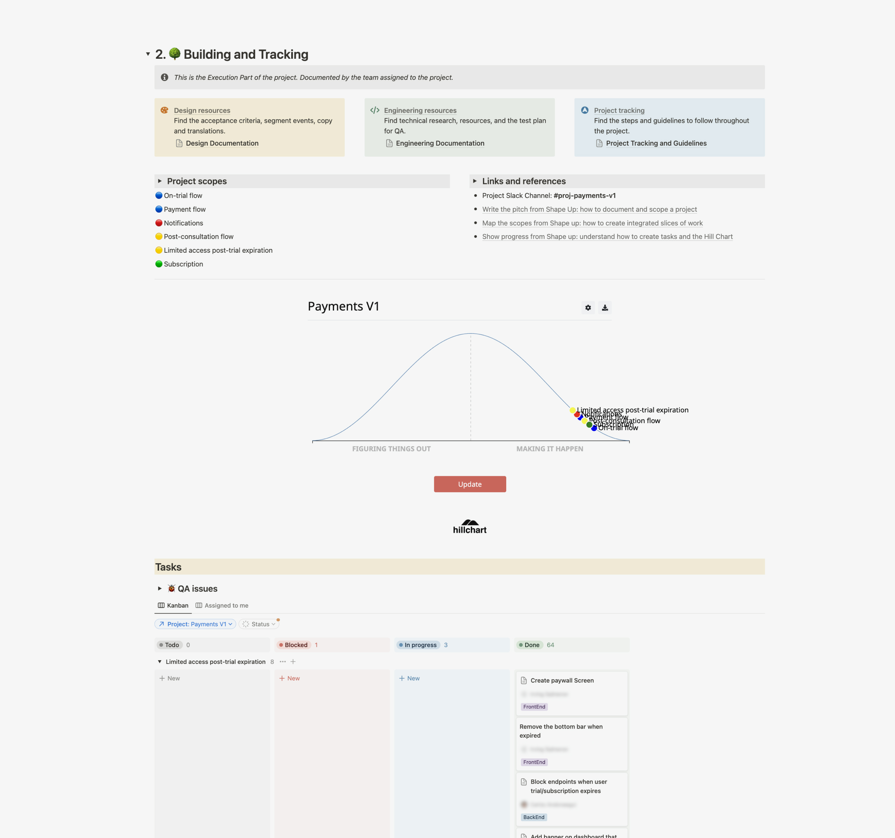
The project
We kicked off the project during one meeting and then kept track of its progress in Notion. Even though we do Shape Up, we use Notion instead of Basecamp because we prefer to centralize the documentation for projects and non-related projects. A few months ago I was able to create a template with all the sections we needed (along with a great tool from the Zero Mile and we use it for every project since then.
Tracking of the project in Notion. This is how it looked at the end.
The developers could start coding from day one because the pitch and the whiteboard were clear and specific. They didn't need mocks to make things work. They could use non-styled components and basic layouts while I worked with the designer to finalize the user interface. QA engineers also had everything they needed to start writing test cases.
User flow with final mockups in Figma
Design of the banner at the top of the Home section
Paywal. Illustration and visual design by Chisa Tanaka
Profile section and final screen after checkout.
Throughout the project, we ran into a number of unexpected tasks and had to make a few trade-offs along the way. Testing took up a significant part of the six-week window, but we planned for that by validating each piece as it was completed—instead of waiting until the end. Thanks to that approach, we shipped on time without delays.
Outcomes
We waited a couple of quarters to start measuring the real impact of our efforts. Over time, we saw a steady increase in B2C subscriptions and began to better understand the behavior of users who were most likely to convert.
Here’s what we found:
Conversion funnel
13% of users who created an account started the subscription flow
1% of those users completed a payment
User behavior
47% of paying users had attended at least two consults before subscribing
Preferences
85% of users chose the monthly plan over the other two options.
68% of subscriptions came from iOS devices
These numbers helped us confirm that early engagement drives conversions and that offering flexibility—rather than pushing long-term commitment—was key to unlocking growth.
B2C Dashboard in Mixpanel
This project helped us launch a solid foundation for our B2C offering—designed, built, and delivered quickly without losing sight of what mattered: giving users a clear, simple way to access care. While our focus remained on supporting B2B partners and their employees, this initiative gave us meaningful insights into how consumers interact with our product when they’re navigating it on their own.
It also surfaced clear opportunities for refinement—like improving conversion, testing pricing models, and adapting the trial experience—all grounded in real usage patterns and feedback. Those insights will continue to guide future iterations, even as we prioritize our core B2B audience.